| | 57th Painting: Her Adornment |  |
|
|
| Author | Message |
|---|
ftariqtx
Moderator

Posts : 1034
Join date : 2011-12-24
 Location : Dallas, Texas Location : Dallas, Texas
| | Subject: 57th Painting: Her Adornment Mon May 27, 2013 3:10 pm | |
| Hi guys, I still have not started on the self-portrait yet. Lots of reasons and excuses (sigh!)... hope to start soon. However, here is a new still life. Nope! not what you are thinking... this is not a real pearl necklace and it is not my wife's. It is a fake and belongs to my little girl...  . As always, all constructive criticism are welcome. Don't hold back... Size: 6"x 8". Time: Don't know, painted a little bit over several days 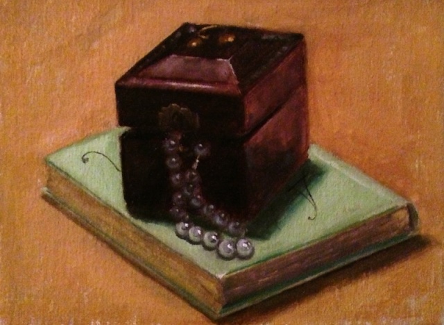 | |
|
| | |
watermixableguy
Moderator

Posts : 972
Join date : 2010-06-11
Location : New Brunswick, Atlantic Canada
| | Subject: Re: 57th Painting: Her Adornment Mon May 27, 2013 8:30 pm | |
| Very nice, Faisal! You have a good touch for composition, this is pretty interesting. Not everyone would have had the courage to show the pearls in part shadow and highlight and you handle it well. The box has really good texture and reflections, the book very solid too. beautiful! | |
|
| | |
ftariqtx
Moderator
Posts : 1034
Join date : 2011-12-24
Location : Dallas, Texas
| | Subject: Re: 57th Painting: Her Adornment Mon May 27, 2013 9:59 pm | |
| Thanks Alan for the very nice complement. What would you do differently, if it were you... does anything jump out at "first glance" that you think you would fix.
Faisal | |
|
| | |
judyfilarecki
Moderator

Posts : 2685
Join date : 2009-11-16
Location : Northern NY and Southern Arizona
| | Subject: Re: 57th Painting: Her Adornment Tue May 28, 2013 4:29 pm | |
| I agree with everything Alan has said. The only thing that jumps out at me as a minor problem is the flatness of the background. It all feels vertical in contrast to the depth of the still life. The book could probably also a have a slight change in value from front to back.
Those pearls are amazing, by the way. No one would guess that they are fake.
| |
|
| | |
ftariqtx
Moderator
Posts : 1034
Join date : 2011-12-24
Location : Dallas, Texas
| | Subject: Re: 57th Painting: Her Adornment Tue May 28, 2013 6:35 pm | |
| Thanks Judy, I agree with you... very good pointers.
Thanks
Faisal | |
|
| | |
JanG
Posts : 678
Join date : 2012-07-20
Location : NC - USA
| | Subject: Re: 57th Painting: Her Adornment Wed May 29, 2013 10:54 am | |
| Lovely, as usual, Faisal. The "pearls" are wonderfully done with the transition from shadow to light and the box is beautiful. I have to agree about the background and the book though. One other thing is that the box feels to be sitting crooked to me. Either it's the photo that's slightly "wompered" or it's the shadow along the bottom (viewer's) left making it appear that way. Perhaps the slightest highlight along the bottom edge of the box would correct that illusion if the photo is straight. I also think the leaves of the book look great and actually all the elements of the composition are very well painted. Now, get busy on that portrait!!!! lol  | |
|
| | |
ftariqtx
Moderator
Posts : 1034
Join date : 2011-12-24
Location : Dallas, Texas
| | Subject: Re: 57th Painting: Her Adornment Wed May 29, 2013 1:35 pm | |
| Thanks Jan, As always, these feedback are very valuable for my growth. It is appreciated. I think you may be right about the box giving the slightly crooked appearance. Yes! I need to do those portraits... Take Care, Faisal | |
|
| | |
judyfilarecki
Moderator
Posts : 2685
Join date : 2009-11-16
Location : Northern NY and Southern Arizona
| | Subject: Re: 57th Painting: Her Adornment Wed May 29, 2013 6:07 pm | |
| The book also caught my eye, but I wasn't sure of how to fix it. The back edge of the book is at a slightly different angle than the front in the wrong direction. Change it to very slightly more horizontal and see if that will help.  Another possibility is if the surface of the book toward the back was slightly darker than the front. Being lighter makes it come forward rather than receding to the back. This may not work, though, since the light source is coming from the left. | |
|
| | |
watermixableguy
Moderator
Posts : 972
Join date : 2010-06-11
Location : New Brunswick, Atlantic Canada
| | Subject: Re: 57th Painting: Her Adornment Wed May 29, 2013 8:06 pm | |
| Judy, I was going to point that out also, but you beat me to it.  This is getting very picky (I am saying this about myself) but I agree that the angle of the far edge is not in perspective, or anyway, not aligned quite right. Faisal, this is the only thing I can see in this painting that I can suggest be improved, bravo! | |
|
| | |
ftariqtx
Moderator
Posts : 1034
Join date : 2011-12-24
Location : Dallas, Texas
| | Subject: Re: 57th Painting: Her Adornment Thu May 30, 2013 9:16 am | |
| I absolutely love it guys... These feedbacks were very valuable and is exactly what i am looking for... I know this is asking too much. But it would be nice, in the future, if you can break down your critique into two categories. (a) What jumps at you at first glance (b) What appears out of whack after a little observation. Thanks a lot... Faisal | |
|
| | |
Crystal1
Posts : 639
Join date : 2010-02-05
Location : Ft Worth, TX
| | Subject: Re: 57th Painting: Her Adornment Thu May 30, 2013 4:25 pm | |
| Still a good painting, Faisal. | |
|
| | |
Sponsored content
| | Subject: Re: 57th Painting: Her Adornment | |
| |
|
| | |
| | 57th Painting: Her Adornment | |
|