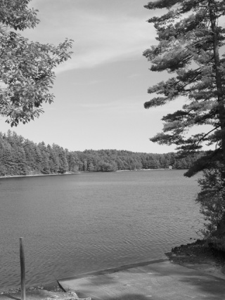
The following is a sequence of steps I used to map out tonal values with a grayscale to help establish my composition for one of my photos. This is based on information I learned from a course taken this Spring with
Johannes. He does have videos available for purchase from the course if you are interested.

Converted to grayscale in Photoshop
Be sure to use the Grayscale choice rather than De-saturation. In some of your photos, there will be a distinct difference that may effect your outcome.
The first thing I did was try to break down the photo into three gray values using a scale with #1 as white and #10 as black.
[1]lite values #2 and #3
[2]mid values #4 and #5
[3]dark values #5 and #7

Improved shapes in the second one.

In the second one, I made the dark shape flow better by not having so many ins and outs of the branches. I also tried to NOT have the positive and negative spaces line up. In the mid tones I joined the left tree to the distant trees and changed the silhouette of the tree line against the horizon to make the overall shape of the lite value of the sky more interesting.
Now I was ready to start painting. I painted in the lite values of the sky and mid values of foreground, but only sketched in the outlines of trees on the right and left. This way I could work on the sky and have it show through the branches as I added them.

I used a grayscale and value finder to establish the colors in the sky and foreground. I uses cobalt blue and titanium white for the lite values of the sky under painting and added some orange and more blue to the mix for the mid value of the foreground.

Use Value finder on palette and painting

I kept checked tonal values through each stage of the painting. The original value mapping was used strictly as a guide. It did not stop me from using other small areas of different values to complete the painting.

Mid tones of left trees

Mid tones of Ramp

Dark tones of right trees.
One thing you have probably noticed was that I did not set aside areas for #1 or above #7. This does not mean you do not use them but #1 should be saved for clouds, waves, snow and other predominantly white areas. #8 an be used for deeper shadows, but if you go much higher than that, you can no long distinguish the color when you stand at a distance.
The rules vary a little with sunrises and sunsets where you would use darker values in darker areas.
Here is the completed painting.

You will notice that I did not follow the outlines of the mapped areas exactly. If I'm not satisfied with things like the outline of the dark trees, I could change it by painting over some of the limbs with titanium white and blending in the blue of the sky. The last picture shows an outline of where I could make a change.

Hope you found this helpful. Feel free to ask any questions. Several of us took the course, so if anyone wants to add more info, feel free to do so.


 Location